Mobile search continues to demonstrate explosive growth and Matt Cutts from Google recently stated that mobile search might actually outnumber desktop searches in 2014. If not in 2014, then it certainly will in the near future. Not surprisingly, desktop ad spending is expected to decline $1.4 billion. With users and the money shifting to mobile, it is even more critical to get mobile right for search.
To get it right, there are 2 major concerns:
- Creating a fantastic user experience from search.
- Getting the technical implementation right so technical issues do not obstruct a website from realizing the success it deserves.
When it comes to mobile success, think like Google
As with all Search Engine Optimization initiatives (SEO), it is best to think about mobile SEO through Google’s eyes. What are they trying to achieve and how will they measure it? Make Google happy and the chances for long term SEO success rise!
It’s all about the search experience!
Google wants users to have a great search experience. They want the users to get what they want and move on to the next search. Whether a desktop user, an Android phone or an iPad, they want users to end up with their question answered and problem solved.
Anything that inhibits the user from achieving their goal (question, problem or need that drove them to Google in the first place) is bad for SEO.
This means understanding who your customer is and what drove them to do a search on Google and led the me to your page. There are several challenges for mobile success that I will dive into.
- Technical
- Physical constraints of a mobile device
- Sacrificing the user experience for business goals
The feature phone era
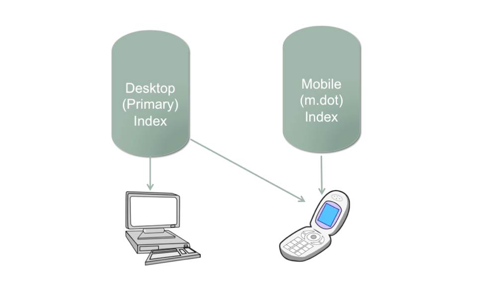
Years ago, Google had 2 indices, one for feature phones (the old dumb phones) and one for desktop. Depending on your device, Google would return different results. Desktop users would get results from the primary index while mobile users could get results from both. If your site had an m.dot version Google would show the m.dot results (pulling from the mobile index) as opposed to the desktop page.
Today: Evolving to a Single Index
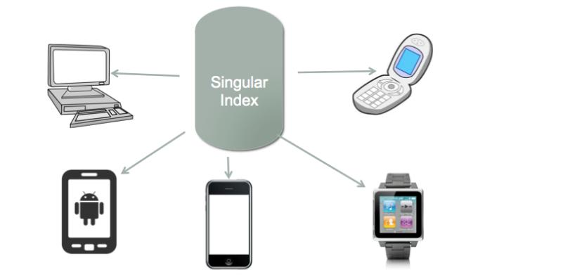
Maintaining multiple indices for Google was problematic in resources required and the increase in complexity with handling 2 indices (often mobile results would bleed into desktop search). With explosive growth in mobile, alternative devices, different displays and form factors; maintaining multiple indices is not sustainable for Google. While the m.dot index is still in play, Google is clearly moving towards a single index. They will returns results to all devices from that index (and that is mostly the case today). This is clear from their mobile recommendation (responsive and adaptive result in a singular URL. When there is a mobile URL, they recommend a rel canonical back to the desktop which will inhibit indexing).
With a single index, Google wants all devices to deliver a similar experience if a page is returned in search. The onus is on the website to insure that happens. When a user on Google searches on a mobile device and clicks through to a result, they need to have their need met just as well as from a desktop device.
With m.dot index shrinking, todays results are generally from the primary index, regardless of device. As sites move towards supporting Google’s mobile recommendations, the m.dot index will become completely irrelevant.
Today, results from the primary index differ very little by device. This will likely change in the future as Google has said that sites that provide a poor mobile experience will be demoted. This makes sense and is consistent with Google’s general trend to promote sites with good user experience and demote those that have poor experience. I expect to see a big shakeup in the organic results in the future on mobile devices. If a website works brilliantly on web but suffers on mobile, why should it continue to enjoy the same success?
Technical Approaches
Traditionally, to provide mobile optimized solutions, websites have implemented an entire new website with distinct URLs (usually in the form of m.domain.com). However, Google recommends responsive web design (RWD).
Responsive design is the technique of creating a single web page that can respond to the device that is viewing it and provide an appropriate user experience using CSS. Google loves responsive design for the following reasons:
- Since all devices are generated off the same HTML and web page, they are much more likely to be getting an equivalent experience.
- Websites won’t have issues with accidentally getting duplicate content indexed.
- Google won’t have to use resources to exhaustively crawl multiple versions of a site as well.
Despite these advantages, Google does not favor responsive devices in the results and I wouldn’t expect them to in the future. They will favor sites that provide an excellent user experience relative to the search query.
However, for large dynamic sites with heavy pages, responsive design can be problematic. RWD is a client side solution, forcing the full page to be loaded on every device. It is also more difficult to deliver device-specific features since those features when those differences are limited by CSS.
Adaptive Web Design (AWD) adapts to the device on the server side and dynamically decides what to serve to the client based on the device. This has the advantage of delivering lightweight pages as well making it easier to deliver unique value to a particular device as the user needs on a phone or smart watch might be quite different than the desktop. With this technique, there is also only a single URL so the duplicate content issue is resolved as well. However, there are some other concerns:
- ISPs that may serve up the incorrect cached version of a URL, perhaps loading the mobile version on a desktop or the desktop version on a smartphone. Google recommends using the Vary HTTP header that instructs the ISP whether or not to serve from cache. However, not all ISPs support the header (including Akami). For pages served up via Akami, the cache would be ignored perhaps impacting site performance. Google still recommends taking this approach so that it can be leveraged when available.
- It is also important to make sure that the Googlebot crawler (not the mobile crawler) ends up getting served the desktop version of the page (which would likely have the most rich content and linking structure which Google is dependent upon). This should not be done via explicitly detecting the Googlebot user agent (which would be cloaking) but rather by defaulting to desktop if not rendering a device specific version.
Multiple URLs
I still tend to prefer the multiple URL approach because it alleviates the caching issue with AWD but still gives you the ability to deliver fast, high performing, light-weight mobile pages. The following technical implementation issues need to be addressed:
- Rel canonicals on the mobile URL – A risk with distinct URLs is that they get indexed, essentially giving you two pages competing for the same result. This is easy enough to solve. You want to make sure you put rel canonicals on the mobile page that link back to the associated desktop page. This will prevent Google from indexing a duplicate page and also prevent Google from wasting resources that it should be using for your desktop site. As an example, if Yahoo had 2 URLs, www.yahoo.com/new for desktop and m.yahoo.com/news for mobile, the mobile page would have the following canonical:
<link rel=”canonical” href=“www.yahoo.com/news” />
- Likewise, when Google crawls the desktop version that URL should point to mobile URL using the alternate media tag. This tag would then be placed on www.yahoo.com/news:
<link rel=”alternate” media=”only screen and (max-width: 640px)” href=”http://m.yahoo.com/news” />
Essentially, you have these bi-direction links removing any possibly confusion on Google part to your technical mobile implementation.
Rel canonicals and rel alternates have a nasty habit of disappearing, linking to the wrong place and the syntax getting broken. It is quite important that these Rel Canonicals appear and persist. I recommend regular testing manual tests or preferably automated tests. This is a test that is built into the SEORadar tool.
Mobile user experience
Creating a great mobile user experience on a small device poses some unique challenges due to physical characteristics of the device as well as understanding what’s different about your mobile users.
Response Time
Response time is even more important for mobile devices than desktops as users are less likely to wait for a page to load. Google recommends sub-second response time for mobile devices. That can be particularly difficult to achieve with responsive design since the all the content is loaded and the pages can be quite heavy.
Understanding your mobile user
When somebody is mobile, they may have distinct needs. For instance, if there is a physical location associated with search, then driving directions may be much more important on mobile. Click –to-call might be much important than a click to chat function, which is more appropriate for desktop users. Get to understand your mobile users and create a custom experience that uniquely responds their mobile needs.
Obstructions to the user experience on mobile
There are several driving forces that often lead to damaging the user experience on mobile and can put sites at risk. These can create problems independent of the specific mobile web technology:
- Interstitials or upsells for mobile apps. As websites aggressively try to get users to install their mobile app, they may be disturbing the user search experience, preventing the user from getting to the content or feature that drove them to the site in the first place. Google strongly recommends against the use of interstitials. Up to this point, I have not seen any sites penalized for using interstitials. Yet, Google is not standing pat so I would recommend against interstitials. It is a calculated risk, in which a website owner has to weigh the benefit of the interstitial (in terms of downloads) vs. the increased bounce rate and potential of getting hit by Google. If you insist on interstitials, I recommend running some split tests and analyze the impact on bounce rate and other success metrics when you use interstitials.
- Intrusive ads – As many sites have struggled to monetize mobile apps, they have gotten creative and sometimes intrusive with advertising. Again, I would definitely pay attention to your bounce rates and success metrics to make sure that you are not negatively impacting users.
- Removing/hiding of content – due to the limited space on a mobile device, sites often remove content or hide it between links. You should make sure that the primary intent of users coming to your mobile site is not obscured by your attempts at a cleaner implementation.
- Google also recommends a link back to the full desktop version of the page (not the homepage). This means the user can always fall back on the full page with the full content.
- Understanding the your specific mobile user and how his goals/needs may differ from desktop.
Summary
To sum up, Google is paying very close attention to mobile as we all are. Getting mobile SEO right is critically important as users jump to their phone or tablet to do a quick search on a whim wherever they happen to be. Understanding and satisfying Google’s objectives combined with a careful technical implementation that is blazingly fast and meets the unique needs of the mobile user will lead to long-lasting mobile SEO success.


